12 Cream Kitchen Ideas — All the Warmth of White, None of the Chill
White kitchens are beautiful in photographs and chilly in February. Cream is the answer homeowners keep arriving at: the same light, bright feeling, but with a warmth that survives grey days, north-facing windows and real family life. These 12 ideas keep cream looking deliberate — never like white that has aged badly.
Choosing the Right Cream
1. Pick a cream with a warm, not yellow, base. The difference between cosy and nicotine is the undertone. Creams built on a whisper of red or brown stay warm; creams built on pure yellow turn sallow under artificial light. Test a big painted board and live with it for two days — the same test-first logic as our warm neutral kitchen ideas.
2. Commit to cream on the cabinets, not everywhere. Cream cabinets against a slightly paler warm-white wall read rich and layered. Cream cabinets, cream walls and cream tiles read as one flat wash. One step of contrast — in either direction — is what makes the colour look expensive.
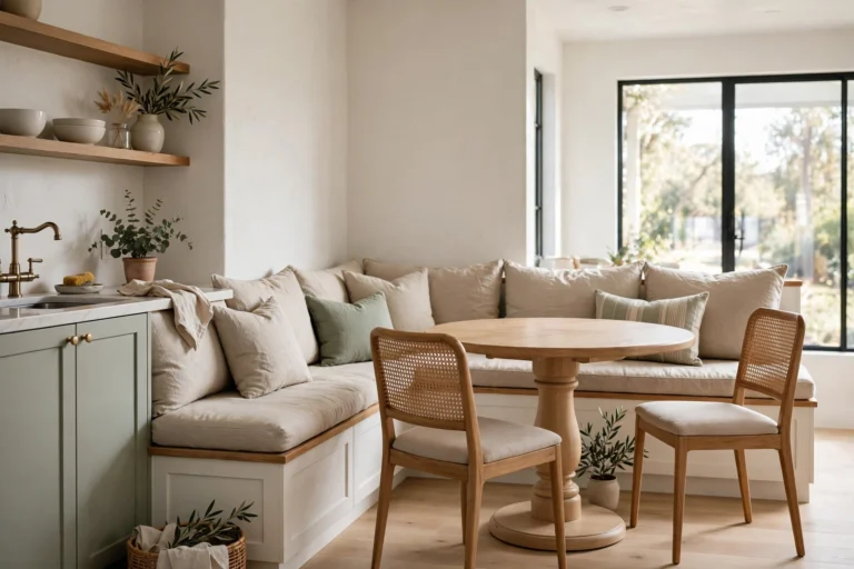
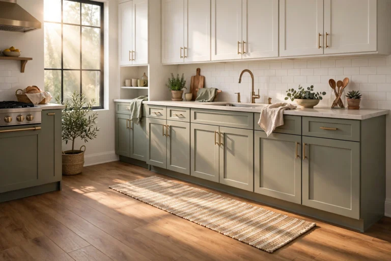
3. Cream loves a mid-tone partner. A sage, mushroom or soft clay island or lower run stops a cream kitchen floating away. The pairing works for the same reason two-tone schemes do in our two-tone kitchen cabinets guide: the darker half grounds the pale half.
Surfaces and Metals
4. Pale stone or stone-look worktops, with gentle veining. A quiet, warm-veined quartz or a honed pale granite keeps the scheme calm. Stark white-and-grey marble veining fights the warmth; gold, taupe or soft brown veining joins it.
5. Brass and bronze are cream’s natural metals. Warm metals on a warm ground is the whole point — brushed brass, antique bronze and copper all deepen cream instead of chilling it. Chrome and polished nickel are not forbidden, but they push the room back toward the cool white you were avoiding.
6. Wood in the middle tones. Honey oak, mid walnut and warm beech sit perfectly inside a cream scheme — on a floor, an island top, stools or shelves. Very pale ash can look washed out and very dark stained wood can look stark; the middle is where cream feels richest.
Texture, Light and Life
7. Add texture because the colour will not do it for you. A handmade-look tile, a woven runner, linen curtains, rattan stools — a near-monochrome room lives or dies on texture. Without it, cream is just blank; with it, cream is serene.
8. Warm light only, and layered. Bulbs around 2700–3000K keep cream golden in the evening; cool bulbs turn it grey-green, which is the one shade nobody chose. Layer pendants, under-cabinet light and a lamp-lit corner so the warmth survives after dark.
9. A black accent, used like punctuation. One black tap, a pair of black pendants or black-framed stools give cream a spine. It is the same trick that stops our white kitchen ideas for 2026 feeling floaty — a small amount of black makes every pale colour around it look intentional.
10. Floors a shade deeper than the cabinets. A floor slightly darker than the cabinetry grounds the room and hides real life better. Cream cabinets over a pale floor can feel like the kitchen is hovering; a mid wood or warm stone floor lands it.
11. Bring the green in. Cream is a background that plants flatter like no other — a herb pot on the sill, a trailing plant on a shelf, olive branches in a jug on the island. Green against cream reads fresh in every season.
12. Keep one true white — in the sink or the ceramics. A crisp white sink, or white everyday china on open shelves, gives the eye a reference point that proves the cream around it was a choice, not a fading accident. That tiny contrast is the professional’s finishing touch.
Choose the undertone carefully, give cream one grounding partner, and light it warm. Do that, and you get the kitchen white promised — bright, calm and kind — without ever feeling cold in it.