16 Warm Neutral Kitchen Ideas That Feel Calm, Bright and Timeless
For years, the default kitchen palette was cool grey cabinets, bright white everything, and chrome finishes. It photographed well, but in real life many of those kitchens felt a little cold and clinical. Warm neutrals are the fix: they keep the light, airy feeling people loved about white kitchens while adding the softness and depth that make a room feel lived in and calm.
The secret is undertone. Warm whites lean slightly creamy, greiges blend grey with beige, and natural wood, stone, and unlacquered metal bring in earthy tones that cool palettes leave out. The result is a kitchen that looks bright in the morning, glows in the evening, and does not date the moment trends shift.
Below is the palette that makes it work, followed by sixteen practical ideas you can mix and match — whether you are planning a full remodel or just a weekend refresh.
The warm neutral palette that never fails
Every warm neutral kitchen is built from the same few anchors. Get these right and almost everything you layer on top will fall into place.
- Warm white — Your base for cabinets, ceilings, and trim. Choose whites with a hint of cream or beige rather than blue or grey undertones, so the room never reads stark.
- Greige and taupe — The bridge colours. Greige (grey plus beige) and soft taupe give walls and island cabinets gentle contrast without going dark or cold.
- Sand and creamy stone — Counters and backsplashes in creamy quartz, honed marble-look stone, or soft beige tones add quiet pattern and warmth underfoot and at eye level.
- Natural wood — White oak, light walnut, or unstained timber in flooring, shelves, or an island brings the organic warmth that paint alone cannot.
- Warm metals — Brushed brass, antique brass, and warm bronze on hardware and lighting tie the palette together and deepen it slightly.
- Soft textiles — Linen, cotton, wool-look runners, and woven fibres in oatmeal, flax, and natural straw tones finish the room and absorb sound.
1. Start with warm white cabinets
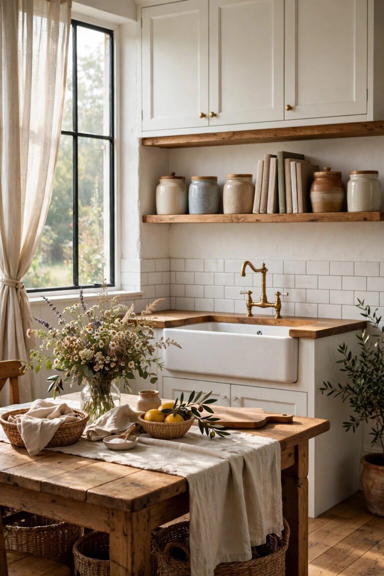
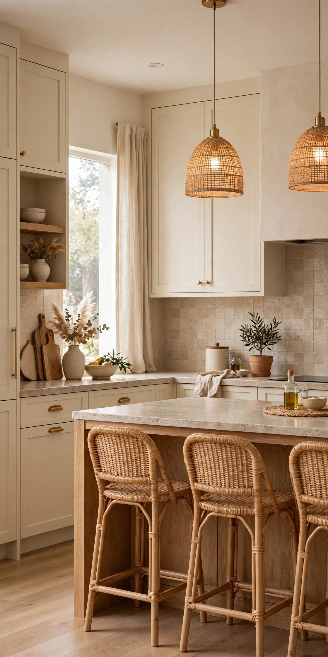
Warm white cabinets are the backbone of this look. Shaker or slim-frame doors in a creamy white feel classic rather than showroom-sterile, and they pair with almost any counter and floor. If you are painting existing cabinets, test your colour on a door in both daylight and evening light, because warm whites shift more than you expect.
2. Paint the walls a soft greige
Greige walls stop a white kitchen from feeling like one flat box. The colour sits quietly behind cabinets, giving the room subtle depth while staying light enough for smaller or north-facing spaces. It also flatters wood tones and brass, which can look harsh against a blue-based grey.
3. Bring in natural white-oak wood tones
White oak is popular for a reason: its honeyed, mid-tone warmth flatters every other neutral. Use it on the island, a section of lower cabinets, flooring, or even just stools and cutting boards. Keep the finish matte or satin — a glossy finish reads more formal and can turn the tone orange.
4. Choose creamy quartz or stone counters
Counters in creamy quartz, warm-veined stone, or a soft limestone look add movement without introducing a new colour. Look for veining in gold, taupe, or caramel rather than icy blue-grey. A honed or leathered finish suits the palette better than a high polish and hides everyday marks more kindly.
5. Add texture with zellige-look tile
A handmade-look zellige tile in ivory, bone, or pale sand gives a backsplash life that flat subway tile cannot. The uneven edges and gentle colour variation catch the light differently across the day, so the wall feels textured rather than busy. It is an especially good choice behind a range or sink where the light plays on it.
6. Swap hardware for warm brass
Brushed or antique brass pulls and knobs are the quickest single upgrade in a neutral kitchen. The warm metal lifts white and greige cabinetry, echoes wood tones, and feels considered rather than matched. Unlacquered brass will patina over time, which only adds to the lived-in character of the room.
7. Layer warm lighting at 2700K
Light temperature makes or breaks a neutral scheme. Choose bulbs around 2700K for a soft, candlelit warmth, and layer three sources: ceiling or pendant lights for general brightness, under-cabinet lighting for tasks, and one softer source such as a small counter lamp for evenings. Avoid daylight-white bulbs, which push every warm colour towards grey.
8. Hang linen or café curtains
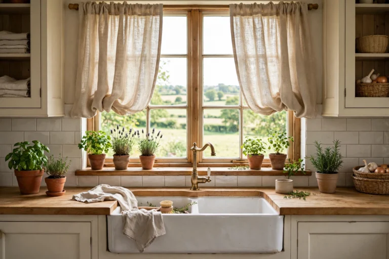
Fabric at the window softens all the hard surfaces in a kitchen. Natural linen curtains in flax or oatmeal filter light beautifully and add a gentle, relaxed drape. In a smaller kitchen or over a sink, café curtains covering just the lower half of the window give privacy while keeping the top open to the sky.
9. Weave in rattan, cane, and seagrass
Woven textures are how a neutral kitchen avoids looking flat. Rattan or cane-front cabinet inserts, woven pendant shades, seagrass baskets for storage, and cane-seat counter stools all add pattern through texture rather than colour. Because they are natural materials, they sit comfortably next to any wood tone.
10. Roll out a warm-toned runner
A runner in faded terracotta, warm beige, or a vintage-style pattern grounds the scheme and protects the floor where you stand most. Vintage-look rugs are particularly forgiving of crumbs and splashes, which matters in a working kitchen. Choose a low pile or a washable flatweave so it stays practical as well as pretty.
11. Style open wood shelving simply
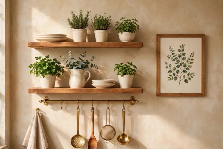
A run of open white-oak or light wood shelves warms up a wall of cabinets and breaks up long stretches of painted doors. Style them with everyday pieces grouped in threes: stacked white or cream dishes, wooden boards, a small plant, and woven or glass storage jars. Keeping the palette tight is what makes open shelves look calm instead of cluttered.
12. Try a plaster or limewash texture
On walls or a range hood, a plaster or limewash finish adds soft, cloudy movement that flat paint cannot match. In a warm off-white or pale sand it reads subtle from a distance and rich up close, and it suits both modern and traditional kitchens. Limewash is also forgiving to apply, since brush marks are part of the intended effect.
13. Lay warm large-format flooring
Flooring sets the temperature of the whole room. Large-format tiles in a warm stone tone, or wood-look planks in a natural oak shade, keep the base light and cohesive. Fewer grout lines make the floor feel calmer and the room bigger. If you are keeping existing wood floors, a warm-toned stain refresh can pull the whole palette together on a budget.
14. Use matte black sparingly, as contrast
A little matte black gives warm neutrals their edge. Think one or two moments only: the faucet, a pair of pendant lights, or the cabinet hardware in a single run. Used this way it sharpens the softness around it. Spread across every fixture it starts to pull the room cold and high-contrast again, which is exactly what this palette is avoiding.
15. Choose warm beige small appliances and décor
The things that live on your counters count as part of the colour scheme. A kettle, toaster, or stand mixer in cream or warm beige blends in instead of fighting the palette, and everyday items like wooden utensils, ceramic canisters, and a linen tea towel do the same job. Storing high-contrast or brightly coloured pieces out of sight keeps the calm intact.
16. Mix metals, but keep them warm
You do not need every finish to match. Brass hardware, a bronze pendant, and a stainless sink can happily share a kitchen as long as the overall family stays warm. The trick is to repeat each finish at least twice so it looks intentional, and to favour brushed or aged finishes over mirror-polished chrome, which is the one metal that reliably reads cold.
Mistakes that make neutrals look cold
Warm neutrals are forgiving, but three common slips can undo the effect:
- Choosing blue or grey undertones — A white or greige with a blue base will fight your wood and brass all day. Always compare swatches next to your flooring before committing.
- Using daylight-white bulbs — Bulbs above 3000K flatten warm colours and make creamy cabinets look dingy grey. Warm light is half the palette.
- Skipping texture — Smooth paint, smooth tile, and smooth stone in similar tones can look flat and chilly. Wood, weave, linen, and handmade-look surfaces are what make the same colours feel warm.
A warm neutral kitchen is not about buying everything beige. It is about choosing each layer — cabinets, walls, wood, stone, metal, light, and fabric — with a warm undertone and a little texture. Start with the palette anchors, add the ideas that fit your budget, and you will have a kitchen that feels bright at breakfast, calm at dinner, and timeless for years.