20 Kitchen Color Ideas to Transform Your Space
20 Kitchen Color Ideas to Transform Your Space
Color sets the mood of the entire kitchen. The right palette makes a small space feel bigger, a modern space feel warmer, and a traditional space feel current. Here are 20 palettes worth stealing, each shown as a real swatch.
These 20 kitchen color ideas span every style, from classic whites to bold dark moods, with practical notes on how to make each one work in a real room.
20 Kitchen Color Ideas
Each swatch below shows the palette the way you will actually see it: upper cabinets, counter, lower cabinets, and hardware.
Classic All White
Crisp white cabinets, white walls, white subway tile. Timeless and easy to update with accessories. Add brass hardware so it does not read cold.
Two Tone White and Wood
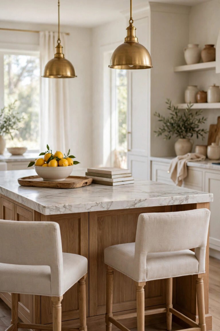
White uppers with natural wood lowers or island. Adds warmth without giving up the bright feel.
Sage Green
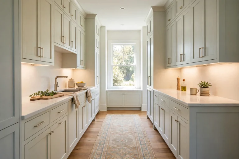
Soft muted green that behaves almost like a neutral. Works on a full cabinet set or just the island, with white walls and warm wood floors.
Navy Blue and White
Navy lowers, white uppers, marble or quartz counters, gold or brass hardware. Bold on day one and still fine in ten years.
Black and White
Black cabinets or a black island against white counters and walls. Striking, modern, and more versatile than it sounds.
Forest Green
Deeper than sage, dramatic and moody. Looks its best with brass hardware and white oak floors.
Soft Gray
A safer alternative to white. Stay with warm grays, or greige, to avoid the cold blue gray trap.
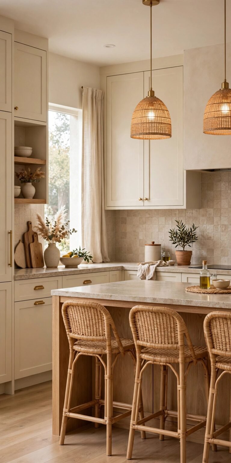
Cream and Brass
Creamy off white cabinets with unlacquered brass that patinas over time. Very European, very 2026.
Charcoal and Wood
Dark charcoal cabinets with a natural wood island or floating shelves. Modern without turning cold.
Terracotta Accents
Terracotta tile floors under white cabinets with warm wood counters. Mediterranean without the theme park feel.
Olive Green
Earthier than sage and far more sophisticated than military green. Pairs with brass and walnut.
Black and Brass
Black cabinets, brass hardware, white counters. The most glamorous combination on this list.
Pure Black
All black cabinets, counters, and walls. Bold and dramatic, and it lives or dies on the lighting plan.
Navy and Gold
Deeper than a typical navy, paired with gold hardware and white marble. The most formal option here.
Yellow Accents
Soft butter yellow on the walls or on a single island. Cheerful and genuinely unexpected in a kitchen.
Dusty Blue
A soft blue gray that reads sophisticated rather than childish. Sits well with white counters and warm wood.
Burgundy or Wine
Deep red toned cabinets for traditional and Mediterranean kitchens. Keep the walls cream so it can breathe.
Mushroom or Taupe
A warm neutral with far more depth than gray. It goes with essentially every counter and floor.
Mint Green
Bright and cheerful for vintage or cottage kitchens. This is the one case where chrome beats brass.
Mixed Bold Colors
One bright accent, in red, teal, or mustard, against an otherwise neutral room. Personality with no commitment.
How to Choose the Right Kitchen Color
- Consider natural light. Kitchens with little daylight need lighter, warmer colors. Dark moody kitchens only work with plenty of windows.
- Match your home’s style. A modern farmhouse can carry sage and cream. A mid century kitchen wants mustard and walnut. Follow the architecture.
- Think about resale. Bold colors are personal. If you plan to sell within five years, keep the cabinets neutral and put the boldness in things you can swap out.
- Test before committing. Buy sample pots, paint large swatches, and check them in morning, afternoon, and evening light.
The cheapest test there is: paint two coats on a large piece of card instead of the wall, then move it around the room for a full day. A color that looks perfect above the sink can turn on you next to the window.
Color Combinations That Always Work
These pairings have held up for decades because each one balances warm against cool, and light against dark.
Where to Add Color in Your Kitchen
You do not have to commit to colored cabinets. There are seven places to put color, ordered here from lowest risk to highest.
- The island only. Low risk, high impact, and repaintable in a weekend.
- Open shelving. Color arrives through dishware, art, and plants rather than paint.
- One accent wall, ideally behind the range or the sink.
- The backsplash, in patterned tile or colored subway tile.
- Bar stools or dining chairs.
- Window treatments.
- A statement rug or runner to anchor the floor.
Common Kitchen Color Mistakes
Choosing color without considering lighting. Every color shifts between daylight and evening LEDs.
Going bold without samples. Mint green in a magazine can read neon on your own walls.
Picking a trendy shade. Very specific colors, think 2010s tuscan red and yellow, date fastest.
Ignoring the rest of the home. The kitchen should flow with the rooms next to it, not feel like a separate planet.
All neutral with no warmth. Even a neutral kitchen needs wood, brass, or another natural material somewhere.
Kitchen Color Trends This Year
Rising
Fading
Kitchen Color Questions, Answered
What is the most popular kitchen color in 2026?
Sage green and warm white are the most requested cabinet colors. Navy remains popular as a secondary or island color.
Should kitchen cabinets and walls be the same color?
They can be, especially in small kitchens where a seamless look makes the room feel larger. Or they can contrast for more visual interest.
What color makes a kitchen look bigger?
Light colors such as white, cream, and soft gray reflect light and make a space feel larger. Painting walls and cabinets the same color creates flow that adds to the effect.
Are dark kitchens going out of style?
No, but they need good natural or artificial light. Dark moody kitchens are still trending in 2026.
What color hardware works with white cabinets?
Brass, matte black, and aged bronze are the top choices. Skip bright chrome if warmth is what you are after.
Pick the One That Fits Your Room
The best kitchen color is the one that suits your home, your style, and the way you live. Do not choose something only because it is trending.
Test real samples in your actual space, and pay attention to how the color makes you feel walking into the room. That is the right color.