12 Kitchen Tile Ideas for Floors, Walls and More
Tile is the kitchen’s hardest-working surface and its loudest design voice — it can cover the floor, climb the walls, wrap an island and line a hearth, all in one room. That range is exactly why tile decisions go wrong: a beautiful sample becomes overwhelming at forty square metres, or three sensible choices argue with each other. These 12 ideas choose tile by format, layout and grout — the three levers that decide whether a tiled kitchen feels calm, warm or busy.
Format and Scale
1. Large-format floor tiles to quiet a busy room. Fewer grout lines means calmer floors and faster mopping. Large stone-look or concrete-look tiles underpin the material comparisons in our kitchen flooring ideas guide — tile wins there on durability, and large format is its calmest form.
2. Small tiles where grip and repair matter. Mosaics and penny tiles bend around uneven floors, grip better under wet feet and let you replace one damaged tile invisibly. Around sinks and in small galley runs, small format is the practical romantic.
3. Handmade-look tiles on one wall only. Zellige-style tiles with varied glaze and edges bring life through light, not pattern. Their movement is the whole show — give them one wall (the hob wall, as in our kitchen backsplash ideas guide) and keep everything else quiet.
4. One tile, two finishes, to join zones. The same tile in matt on the floor and gloss on the wall ties an open-plan room together while the finish change marks the working zone. It reads as one decision, not two purchases.
Layout and Grout
5. Stack bond for modern calm, brick bond for tradition. Aligned grids feel contemporary and make small tiles look bigger; offset brick bond feels classic and hides slightly uneven walls. The layout changes the room as much as the tile — lay both patterns on the floor before choosing.
6. Herringbone on the floor, nowhere else. A herringbone floor is a pattern with a strong pulse. It earns a room with plain cabinets and quiet walls; paired with a patterned wall tile it becomes a shouting match.
7. Grout colour is a design choice, not a default. Matching grout makes a wall read as one surface; contrasting grout draws the grid and doubles the pattern. Mid-tone grout is also the honest choice for floors — white grout under a family’s feet is a cleaning commitment, not a colour.
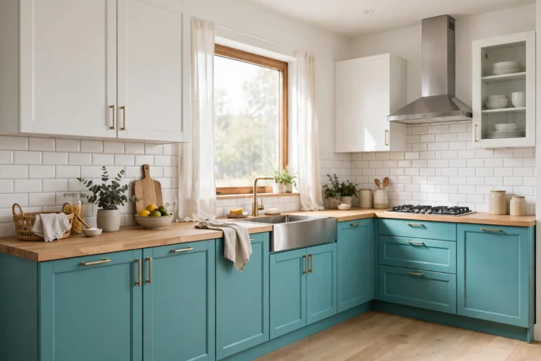
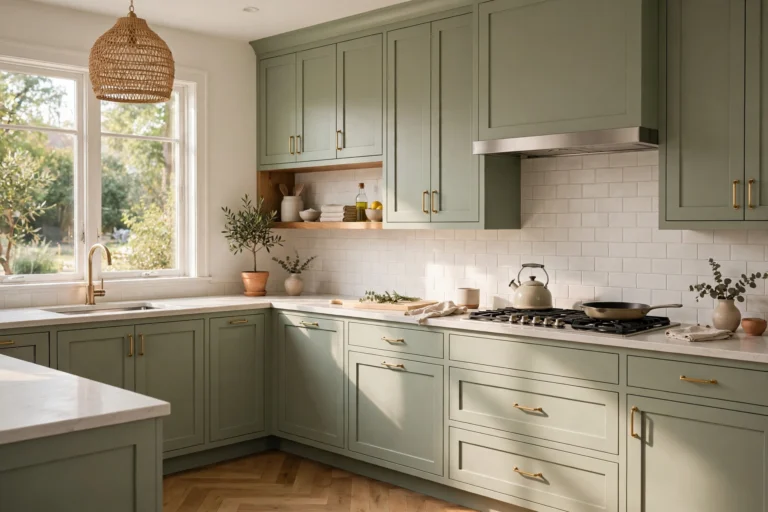
8. Tile the splashback full height, skip the upstand mix. One clean run of tile from worktop to ceiling or shelf removes the fussy tile-meets-upstand-meets-paint junction and makes small kitchens feel taller. The zones it protects are mapped in our kitchen backsplash ideas guide.
Where Else Tile Earns Its Keep
9. A tiled island front as the room’s one artwork. The island’s kitchen-facing side takes scuffs and kicks; tile armours it and can carry the room’s single bold colour or pattern while every other surface stays plain.
10. Tile inside a range recess or hearth for heat and wipeability. Behind and beneath a range cooker, tile handles heat and fat splashes better than paint ever will. Dark grout and a mid-tone tile make it the lowest-maintenance square metre in the house.
11. Porcelain that imitates wood or stone, used honestly. Modern porcelain planks give wood’s warmth pattern with tile’s waterproof body — ideal where real wood would suffer by the sink. Choose a believable grain, vary the planks during laying, and it fools everyone except the feet, which get the durability.
12. Sample at full scale, in your light, with your grout. Tile changes more between showroom and home than any other material — glaze colour shifts with your light and grout reframes everything. Three tiles, grouted on a board, leaned where they will live for two days: that test has saved more kitchens than any trend list. If you plan to lay them yourself, the step-by-step method is in our how to tile a kitchen backsplash guide.
The pattern across all twelve is restraint with intent: tile does the most in a kitchen when one choice leads — one format hero, one pattern at a time, grout treated as part of the design rather than the filler between decisions. Get those three levers right and tile stops being a risk to agonise over and becomes what it should be: the surface you stop noticing because it never stains, never swells and never goes quietly out of date.